
LFW started a few days ago and ends Wednesday, so let's take a look at the designers who've shown and we'll keep you updated throughout. London always has the craziest fashion, and I want you to keep in mind that this is from the point of view of a New Yorker who has never been to London. Click on each image to see the whole collection.
Ann-Sofie Back
This collection lacks shape. She is not paying attention to the female body, rather she is focusing on the shape of the clothing. I love the metal hoop around the left knee, but is that...tape on her boobs? Also, if you are going to go for boxy cuts, make sure it compliments a woman's body. We have shape and curves, we are not broad and husky! Does the shape of the clothing look good on the girl? No? Throw it in the garbage I don't want to see it.
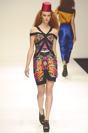
Basso & Brooke
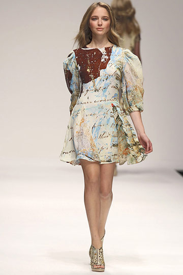
Some the girls look prego! Is it just me? The looks were not put together very well. I love the idea of using a romantic/old print to inspire a collection but the hair/makeup was conflicting because it didn't make sense! It was too plain and boring, and in turn you have an off balance outfit. Not to mention a lot of the patterns clash. Not the articles of clothing separately, per se, but the ones that were paired together (take a look at slide numbers 13 & 14). They *almost* work, and the fact that they don't makes me cringe! And those pants on slide 17.........OMG those pants on slide 17....
Betty Jackson
I didn't realize I was watching someone recreate Marc Jacobs; looks like they used the wrong shoes. Whats up with the folded/creased pant look? Is that the classier harlem pant? YOU CAN'T DO IT. Only a few designers have been able to pull those pants off somewhat normally. Pants are supposed to fit the body, not make you look bigger. I hope this is not what people wear in london because this is a fashion disaster. Look at the sleeves...too long for regular wear, too short for haute couture wear. Pick a side, bebe.
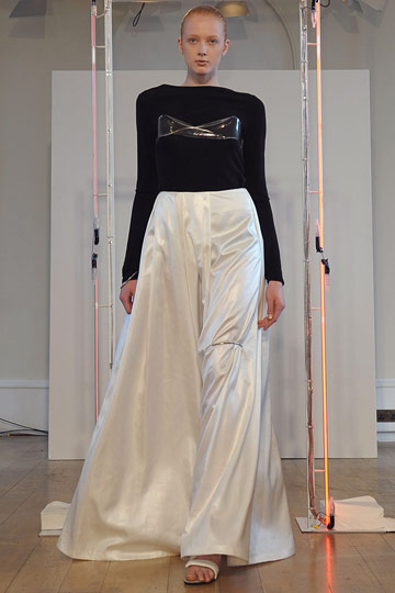
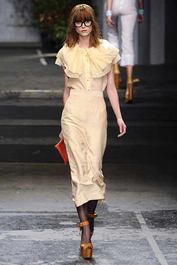
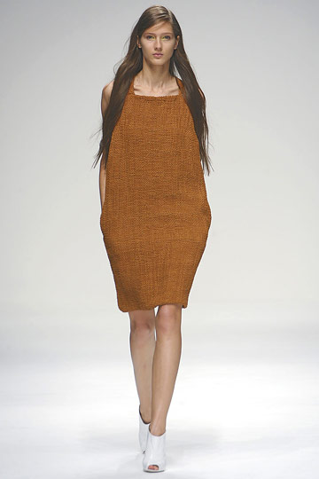
Bora Aksu
In love with the tights, though I think if the design was heavier/darker at the inner part of the thighs it would slim rather than extend the legs outward. He did the loose pants right at slide 14. Not too loose and not too tight. Perfect. That "grey with a pop of color" color palette though...so over it. A lot of the pieces make the girls look chunky and bulky. I give him a C-.
Charles Anastase
Thank you, thank you so much! Someone who keeps up to date with the colors of next season: pastels. Those shoes though.......I hate walking in shoes I know I'm going to tip over in, especially when the platform is not flat on the bottom and when it is wood that chunky. BUT.......it looks fabbity fab fab! It's dramatic! Something I would totally risk my ankle and dignity to wear. I love the accents of the glasses and the sparks of color that are not too in your face. Right on dot, bebe. Of course the whole collection couldn't be perfect (an indistinct metaphor for LFW as a whole) because slide 11 looks like a nurse's dress. I knew somewhere, somehow, someone would ruin pastels. But if this is what people wear in London, if this collection is the epiphany of someone who showed up to a flat party (is that what they call it?) and saw what everyone was wearing, then pack my bags, I'm ready for a vacation.
House of Holland
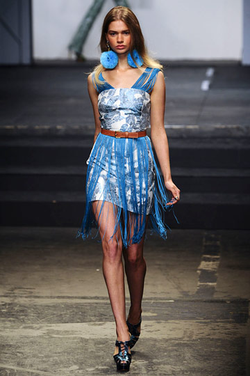
Big big fan of House of Holland. I love the different hues of green he uses in the first look, and it is tied together with the gold, but none of them clash because they are all within the same hue category and the belt ties the skirt and green together. Unfortunately, this collection also has the attention span of an ADD-riddled 3 year old. It was all good until the batshit crazy fringe and tacky stars made a grand entrance. However, I am really into slide number 4 because of the proper use of seventies fashion allocated to next season. Somehow one of Ralph Lauren's models fully dressed decided to make an appearance at slide number 6. They really need to tighten security in those places. And what's up with the fluffy things? I'm a little too old for that, we'll just leave it on the runway. The bags are delicious, and I'm having a 1-2-3 moment looking at slide 14...those sleeves!!!!!!!!!! To DIE!!!!!!!!!! I would rock the fock out of those. I still don't know how I feel about slide 28's boobs.
Jasper Conran
I'm going to go unpack my bags now. The sweater above is the only thing I can fathom to look at, so that's why it's up there. It's also kind of Twiggy inspired. Kind of. I'm not responding favorably to the color mixture and the fabrics...they look matronly and stale. Those aren't shoes, they're sneakers. With a dress. And a patent leather purse. Where's the quality?
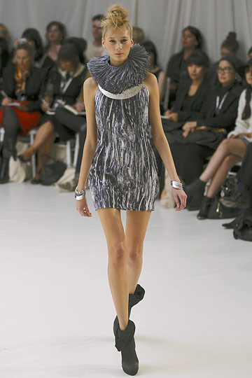
John Rocha
Boyfriend's bringing in something that was in this season and transforming it into next season. That normally works, if people aren't paying much attention to the trends this season. Unfortunately for Rocha, they are. Some of these dresses are interesting and then he'll throw one in there for shits and giggles and try to explain to me that it goes with the whole theme. How are you going to tell me that? I have eyes, and I can see that you can't pull it off. Sowwy. But, I will say John Rocha used one of my favorite themes. The look above is so androgynous I almost went to go look for my size. Then I realized it was a guy. Love the short pants but the key here is to not make them look like capris or cut-offs. Number 14 though....what is that? "I got tangled up in my sheets and decided to pay tribute to the ghost of bridezilla and tie it around my body. Then I went to the store to pick up some potatoes and thought it would be environmentally friendly to throw them in my sheets and run, just run."
I think I'll do quotations every time I see something completely ridiculous and feel the need to personalize heinousness.
Number 16 was inspired by Edward Cullen, the guy from The Darkness, a lab technician, and a hooker.
You took some crochet man, cool. Some jersey fabric, okay. Tweed.......tweed...........tweed? You can't just throw tweed onto a catwalk and expect it to stick!
In order to fully grasp the beauty of this collection one must look for themselves. It is so amazing I decided not to post a picture. Just click the name and you can see the whole collection. Lampshades for skirts? That structured shoulder..putter/over? I don't know what that would be called, because technically it's not a shrug. Behold, the shoulder putter over. This is terrific, so terrific I have no words for it. For once in my life I am speechless.....I have been waiting for this since I was 8. One question: Can I be your muse?
Osman Yousefzada
I have been buzzed into a Fred Flinestone cartoon. I don't have patience, and that is something I will never apologize for. I couldn't finish looking at this collection, it's a joke.
PPQ
By this point you have to realize my head hurts from looking at so many colors and ugly colors and designs and ugly designs and fringe and more fringe and some MORE fringe and then some surprise fringe and now this. Tragic, boring, uninspiring, and plain. Worse than that woman at Paris International Airport dressed in heavy duty socks with hiking boots ready for an 8 hour flight. Those shoes? Too bulky with no incline makes it look orthopedic in nature. Let's get rid of those hats, please, this isn't the Ottoman Empire.
Richard Nicoll
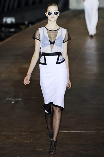
This reminds me of when I used to do theater makeup. They're good! I've decided that this is the Proenza Schouler of the east. Beautiful, dark, mysterious, fresh, a breath of fresh air. Really, its like washing off a clay mask after 14 minutes of not being able to move my face. I do not like those sunglasses, however. They are pushing it. But I love when sheer can be done well and layered tastefully. The bold black outline on the white fabric is so calming and that curled turtleneck collar..to die for! Beautiful London fashion done right.
Sass & Bide
This is the show I've been looking forward to, the only show during LFW that I really give two shits about. This collection is beautiful, the details are classic S&B and the lesser obvious accents are beautiful. The neck wear is elegant yet brutal and the colors! Perfect! One of my favorite collections I have seen yet, I love every single look. The shoes are so simple yet they tie the look together so well. The use of metallics, everything! So very well done.
Vivienne Westwood Red Label
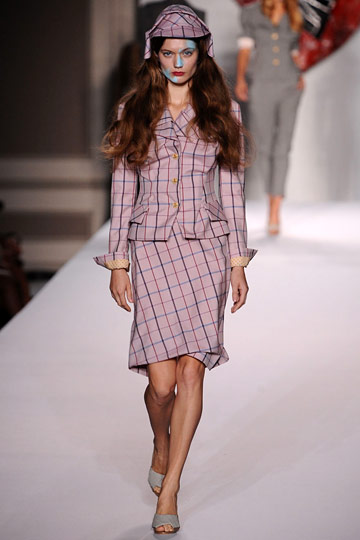
I appreciate both of Westwood's labels and I love to look at her collections because they speak to me, but not in words. It's something that can't be described in words. Her Red Label is wearable for me. I love how she always keeps her signature asymmetrical 17th century cuts, cinched skirts and waists, and hard rock style for every show she puts on. I wouldn't wear any of the clothes from her Vivienne Westwood label, but I might consider her Red Label. It's not necessarily more my style, it's just less of not my style.
Paul Smith
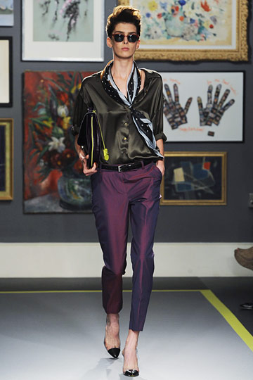
I love that he begins with menswear..which is executed impeccably, and then introduces a more feminine 1950's look while keeping accessories bold and butch. I love it.
Mulberry
We all know Mulberry is one of my favorite brands. I enjoy the "rainy day debbie downer" aura the clothing gives off. I love the heavy, thick footwear and how the colors correspond with the clothing rather than clash against it. I can fall asleep in Mulberry, get up in Mulberry, work in Mulberry, and go to the gym in Mulberry it looks so comfortable.